This post is part of a series of posts on Adjusting Exposures. The series begins here.
When images in this post have nearly identical top and bottom halves, top halves show effects of adjustments and bottom halves show the original image.
Levels Adjustments in Photoshop
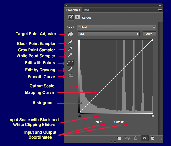
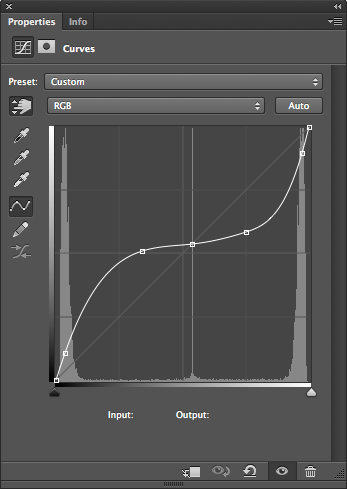
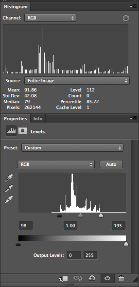
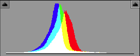
Figure 1 shows the Histogram window and the Levels adjustment menu.
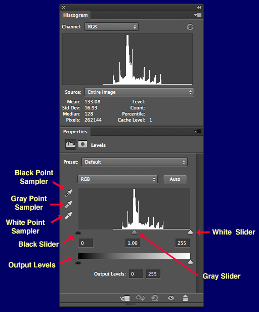
Figure 1. Histogram and Levels adjustments. Data are for the image in Figure 2.
The Levels adjustment modifies an image by mapping input tones to output tones. Three parameters specify the range of input tones:
- Black Slider — the lightest tone in the original image that will be mapped to the darkest tone on the output range.
- White Slider — the darkest tone in the original image that will be mapped to the lightest tones in the output range.
- Gray Slider — defines the tone in the original image that will be mapped to the middle tone in the output range.
The Black Slider and White Slider have values from 0 (black) to 255 (white). The Gray Slider has values of Gamma for a transformation that maps the tones between tones Black and White Sliders onto the output range. Gamma has a value of 1.0 when the Gray Slider is halfway between the Black Slider and the White Slider. The value of Gamma is greater than 1.0 if the Gray Slider is closer to the Black Slider and less than 1.0 if the Gray Slider is closer to the White Slider.
The output range is specified by an Output Black Slider and an Output White Slider. Tones darker than the Black Slider value are mapped to the darkest tone in the output range. Tones between the Black Slider value and the tone defined by the Gray Slider are mapped to tones between the darkest tone and the middle tone in the output range. Tones between the tone defined by the Gray Slider and the White Slider value are mapped to tones between the middle tone and the lightest tone in the output range. Tones lighter than the White Slider value are mapped to the lightest tone in the output range.
I’m not going to talk about color adjustments other than to point out that in addition to having an RGB adjustment for mapping gray tones, Levels has Red, Green, and Blue scales for mapping color values. Color mappings can be set with slider controls similar to the Black, Gray, White, and Output Levels Sliders used for RGB adjustments. It’s also possible to use the Black Point, Gray Point, and White Point Samplers to select colors in the image that are to be mapped to black, 50% gray, and white.
Tip: Holding down the Option key on the Mac or Alt key on Windows while moving the Black and White Sliders displays colors that will be clipped (i.e., dark colors that can’t be made any darker because one of the Red Green or Blue values is 0 or light colors that can’t be made any lighter because one of the Red, Green or Blue values is 255).
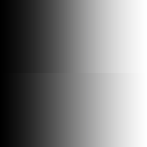
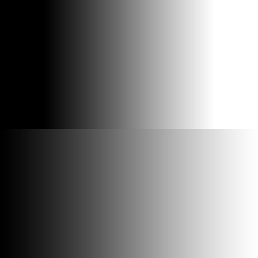
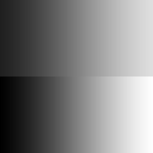
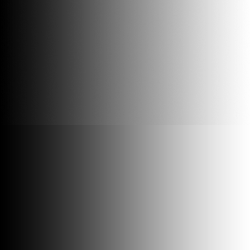
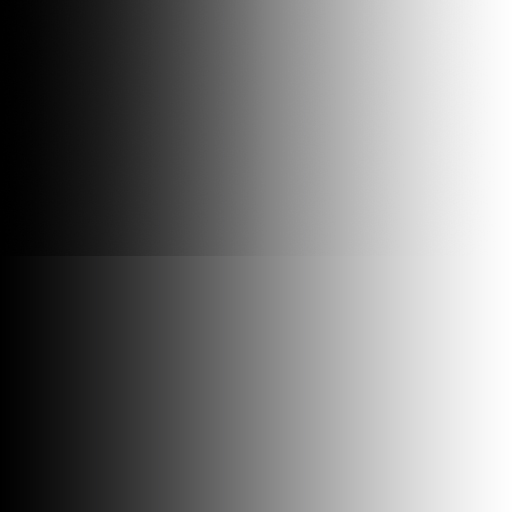
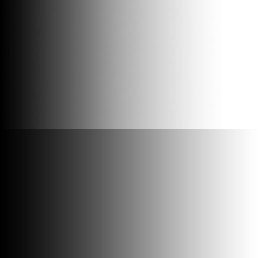
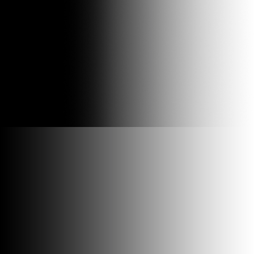
To see how the Levels adjustment works, let’s look at a low contrast image. The graphic in Figure 2 was constructed by using a soft brush to paint various tones on a gray background. You can click on this image to get a larger version that can be downloaded for trying out some of these adjustments yourself. The histogram and default Levels adjustments for the image in Figure 2 are shown in Figure 1.
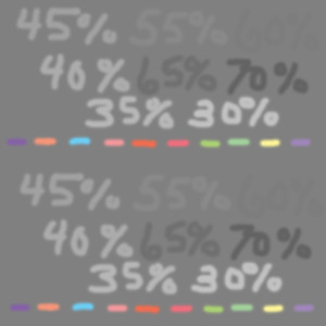
Figure 2. Example of an image with and abundance of mid-tones, but few light and dark tones.
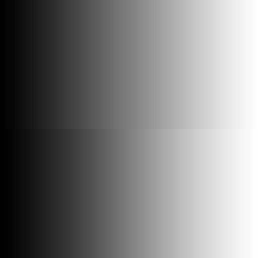
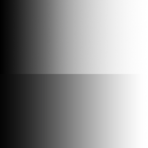
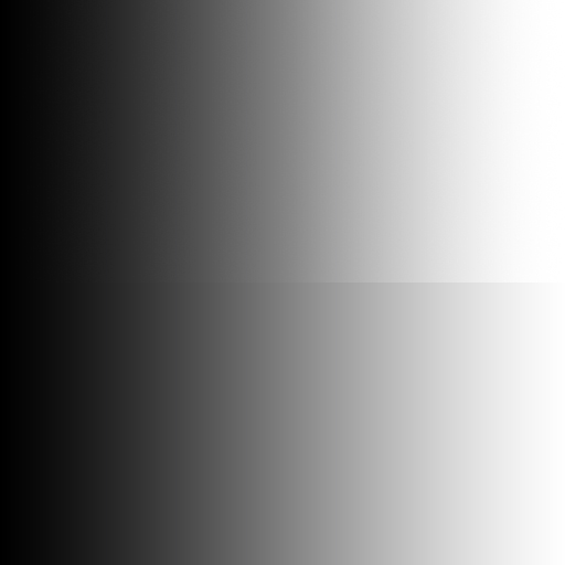
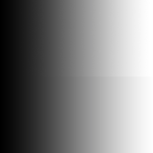
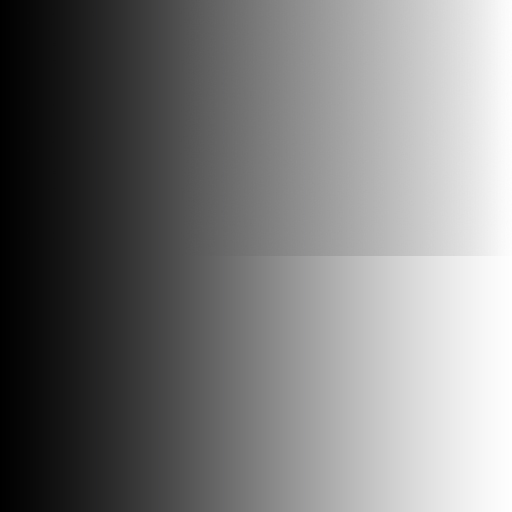
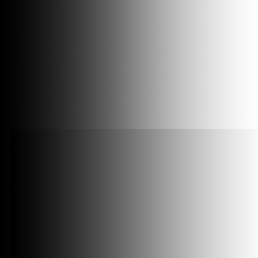
Let’s see how levels might be used to add a little pop to the image in Figure 2 by spreading colors out over a larger range of tones. For the image in Figure 2, the ���Black Slider can be increased to 98 and the White Slider can be decreased to 195 without clipping any of the grays. The resulting image is shown in Figure 3. Some colors were clipped by the adjustment, but grays were not.
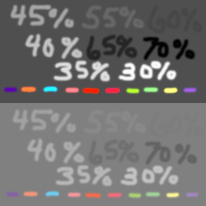
Figure 3. Image with Black, Gray and White Levels Sliders set to 98, 1.00, and 195. Output Black and White sliders are set to 0 and 255 respectively. As with other examples, the bottom section of the image shows an unadjusted version of the image.
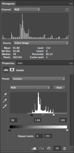
Figure 4. Histogram and Levels adjustments for the image in Figure 3. (Colors in the unadjusted bottom section of the image are not included in the Histogram.)
Figure 4 shows the Histogram and Levels settings for the adjusted image in Figure 3. The Histogram display in the upper panel shows the histogram after adjustment. Notice the comb effect. This comes about because the limited number of tones from 98 to 255 are spread out over the output range of 0 to 255. The Levels display in the lower panel shows the histogram before the adjustment. Clipped tones, which in this case correspond to some of the colored dashes, fall outside the range between the Black Slider and the White Slider.
The background in the adjusted image shown in Figure 3 is now much darker than the background in the original. You can see why this might be by looking at the position of the Gray Slider in the Levels adjustment. It’s significantly to the right of the peak tone in the Levels Histogram. This peak corresponds to the gray background color that dominates in the original image.
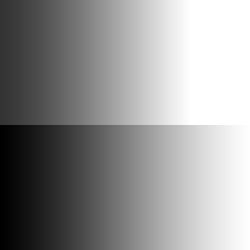
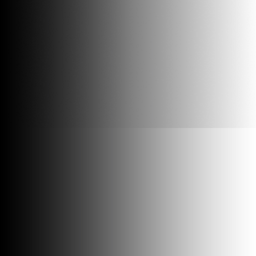
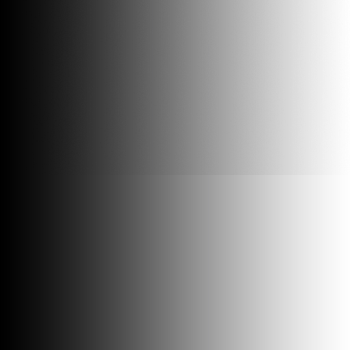
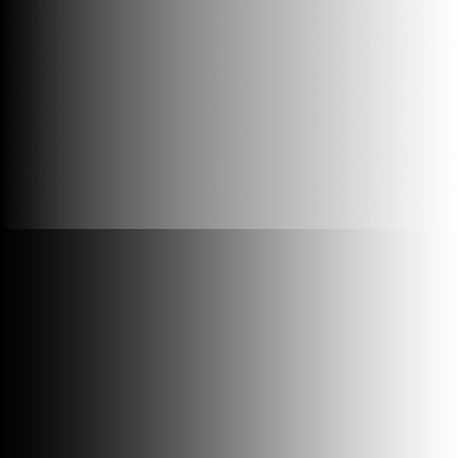
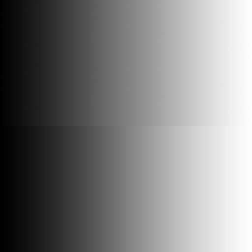
The Gray Slider can be moved to make the background color in the adjusted image identical to the background color in the original. With Output Levels of 0 to 255, tones between the Black Slider value and the tone indicated by the Gray Slider will be spread between Black and 50% gray. If we want the background color to be unchanged we’ll have to move the Gray Slider to the left so it’s closer to the gray peak in the original image. The result of doing this is shown in Figure 5.
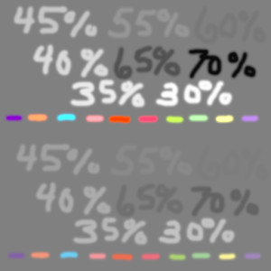
Figure 5. Adjusted images with Black and White Sliders set to 98 and 195 and the Gray Slider set to 1.7.
Recall that Gray Slider values are Gamma parameters for a transformation rather than tone values. In this case background grays are matched reasonably well by setting the Gray Slider to a Gamma value of 1.7. Figure 6 shows the histogram for the image in Figure 5. Note that the peak is now at the center of the gray scale.
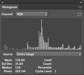
Figure 6. Histogram for the image in Figure 5. (Colors in the unadjusted bottom section of the image are not included in the Histogram.)
Levels Adjustments to a Photograph
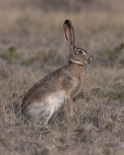
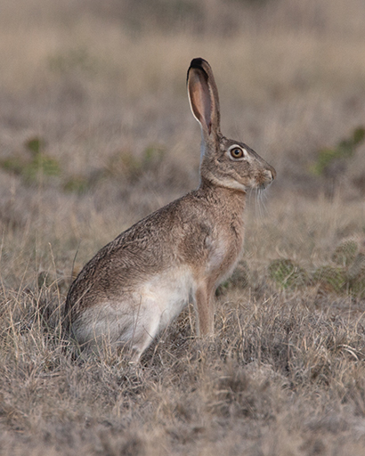
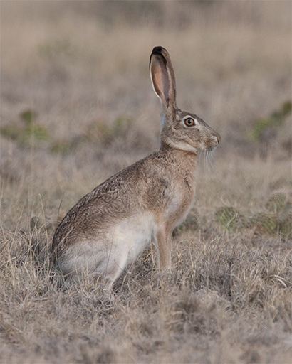
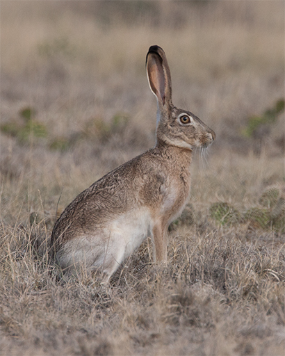
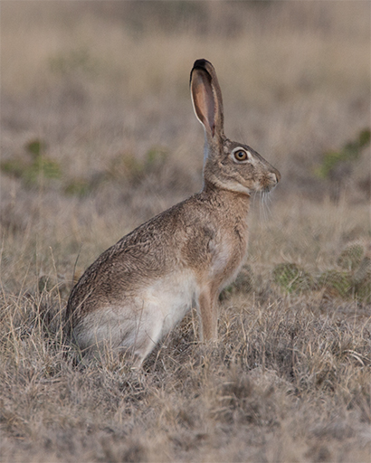
Let’s try adjusting Levels on the Jackrabbit photograph discussed in the post on Basic Adjustments with Camera Raw 8 and displayed again in Figure 7.
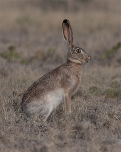
Figure 7. Unadjusted photograph of a jackrabbit.
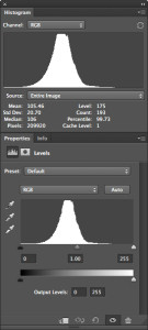
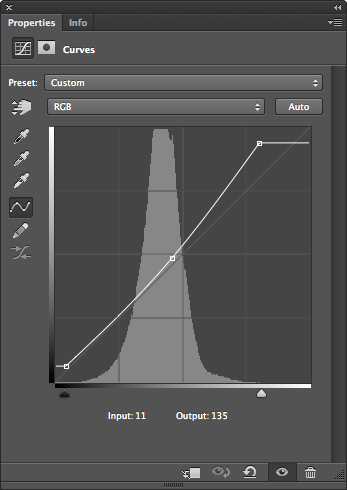
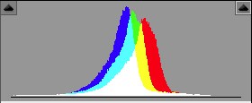
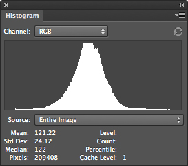
Figure 8. Histogram and Default Levels adjustments for the jackrabbit photo in Figure 7.
Although my normal workflow is use Photoshop to refine Basic Adjustments I’ve made in Camera Raw, for purposes of demonstrating Levels I’ll start with the original unadjusted image in Photoshop for this example. The Histogram and Levels adjustments for the unadjusted jackrabbit photo are shown in Figure 8.
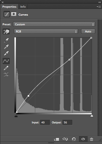
As we noted earlier, the histogram for the unadjusted jackrabbit photo is shifted toward black. Occurrences of tones also fall off dramatically for both a both ends of the scale. At the cost of only a bit of clipping in the blacks, these deficiencies in the image can be remedied by moving the Black Slider to the right and the White Slider to the left. I chose Black and White Slider values of 10 and 205 for my adjustment.
The Black and White Slider adjustments left the Gray Slider on the left site of the tone peak. To my eye the resulting image was too bright. Moving the Gray Slider right to a Gamma value of 0.95 cut down on the overall brightness and enhanced the detail in the jackrabbit’s coat. The results of these adjustments and the associated Histogram are shown in Figures 9 and 10.

Figure 9. Jackrabbit photo with Black, White and Gray Levels Sliders set to 10, 205, and 0.95.
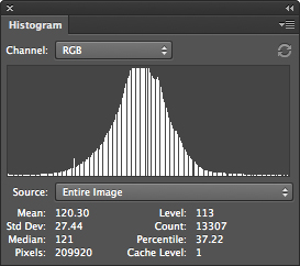
Figure 10. Histogram for the jackrabbit photo in Figure 9. Note the combing associated with the Levels adjustments. A small amount of black clipping is apparent from small spike on the left side of the histogram.
One final levels adjustment of this jackrabbit photo may be called for. There really weren’t any dark shadows or bright highlights in the scene that the photo is attempting to depict. Perhaps an adjustment of Output Levels is would be in order. Figure 11 shows the result of setting the Output Black Slider to 15 and the Output White Slider to 240. To my eye this is a more accurate rendition of the scene than the image in Figure 9.

Figure 11. Jackrabbit photo with Black, White and Gray Input Levels Sliders set to 10, 205, and 0.95 and Black and White Output Levels Sliders set to 15 and 240.
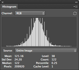
Figure 12. Histogram for the jackrabbit photo in Figure 11.
Figure 12 shows the Histogram for the photo in Figure 11. Adjusting Output Levels completely eliminated dark shadows and bright highlights and produced some additional combing in the Histogram.
Combing and Bit Depth
JPEG files and most display devices have a bit depth of 8 bits per channel: 28 or 256 values of Red; 28 values of Green; and 28 values of Blue for 224 (16,777,216) possible colors and 256 possible gray tones. Levels adjustments almost always eliminate some colors and gray tones from images. Raw files created by modern digital cameras have bit depths ranging from 12 to 16 bits per channel: between 236 (68,719,476,736) and 248 (281,474,976,710,656) possible colors and 212 (4,096) to 216 (65,536) possible gray tones.
Consider the adjustment of Input Levels in the jackrabbit example. Setting the Black Slider to 10 eliminated 10 dark gray tones and setting the White Slider to 205 eliminated 50 light gray tones. That left 196 gray tones to be mapped to the range of 0 to 255. No gray tones are available to map to 60 gray tones — approximately 23% of the output range is eliminated.
Photoshop can process images that have 8, 16 and 32 bits per channel. To this point, all of my examples have been created with 8-bit images. Suppose that instead of processing an 8-bit per channel image we had processed a 16 bit per channel image derived from a raw file containing a 12-bit image with 4,096 possible gray tones. The same proportion of gray tones would be eliminated by the adjustments — in this case 960 values. However, 3,616 values would remain. Most of the combing is eliminated when these 3,136 gray tones are mapped to the 256 gray tones used for displays.
Figure 13 shows a jackrabbit image that was derived from a 14-bit raw file that was processed as a 16-bit image and modified with the same Levels adjustments as the image in Figure 11. The difference between the two images is subtle. However, when I compare the the larger versions of the images that I get by clicking on Figures 11 and 13, it seems to me that the image from Figure 13 shows finer detail than the image from Figure 11. To me this is particularly apparent in variations of color in the jackrabbit’s fur.
Figure 14 shows the Histogram the image in Figure 13. Levels adjustments created the slightly jagged edges, but the severe combing has been eliminated.
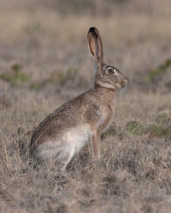
Figure 13. Jackrabbit photo derived from a raw file opened as a 16-bit image and modified with Black, White and Gray Input Levels Sliders set to 10, 205, and 0.95 and Black and White Output Levels Sliders set to 15 and 240.
- Figure 14. Histogram for the jackrabbit photo in Figure 13.
I generally have my version of Camera Raw set to open files in 16-bit mode instead of 8-bit mode. As it comes out of the box (or off the web as the case may be), Camera Raw sends images to Photoshop in 8-bit mode. To switch to 16-bit mode, locate the lineat the bottom of the Camera Raw display that looks something like the one shown in Figure 15, click on it, and set Depth to 16 bits/channel in the menu that gets displayed. The new setting with persist until you change it.

Figure 15. To charge the mode with which Photoshop images get opened from Camera Raw, click on the line like this at the bottom of the Camera Raw display.
Saving JPEG versions of files automatically converts them to 8-bit more. Some other formats like TIFF can be either 8-bit or 16-bit mode. The Photoshop Image / Mode command can be used to convert a 16-bit image to an 8-bit image for applications like printing that often require 8-bit images.
(A note about histograms: Histograms in these posts were collected from Photoshop versions of files before they were saved as JPEGs. Converting files to JPEG format destroys some information and tends to smooth out histograms a bit. You’ll get slightly different histograms if you download example JPEG files and load them into Photoshop.)
Levels Can’t Improve Some Images
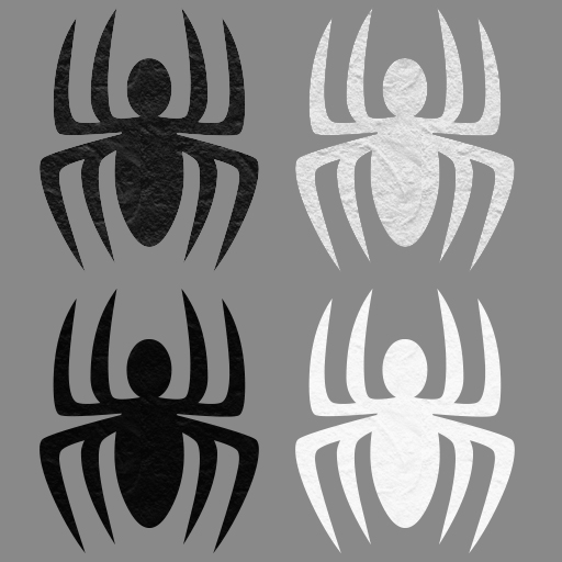
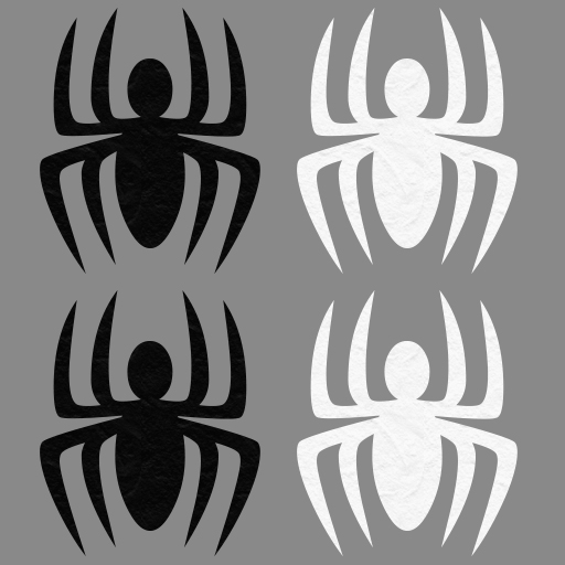
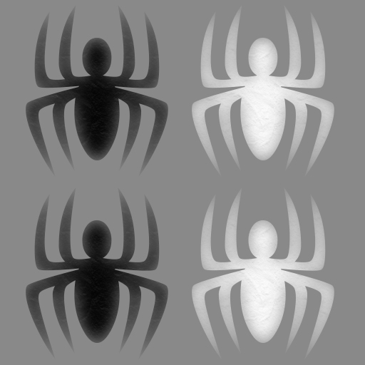
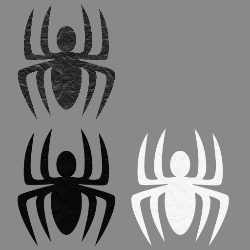
Generally, Black and White Slider adjustments in Levels work only for images that have few dark or light tones. Unless used judiciously, Black Slider adjustments can destroy details in shadows and White Slider adjustments can destroy details in highlights. I contrived the image in Figure 16 to demonstrate this.
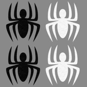
Figure 16. Both dark and light spiders in this image have detail that could be enhanced with Levels adjustments, but without using multiple masked Levels adjustments, it’s not possible to show detail in both highlights and shadows.
Figure 17 shows the Histogram for the image in Figure 16. It has sharply peaked distributions in both dark shadows and bright highlights and a very sharp peak for the gray background.
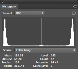
Figure 17. Histogram associated with the image in Figure 16.
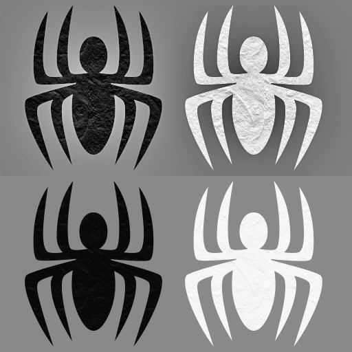
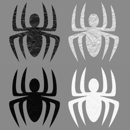
We’d like to enhance the detail in both shadows and highlights without affecting the gray background. Black, White and Gray Slider adjustments can be set to enhance either shadows or highlights after which Output Levels can be adjusted to return the background to gray. Several examples of these adjustments are displayed in Figures 18 through 21. As with other examples of this sort, the bottom half of the display shows the unadjusted image.
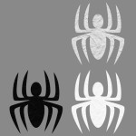
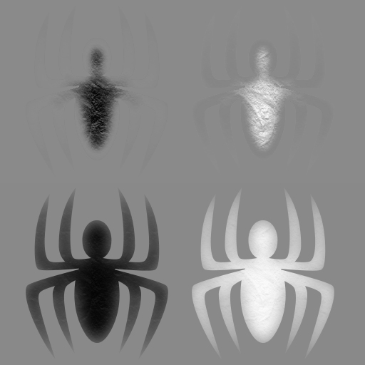
Figure 18. Black Slider at 225; Output Levels adjusted to match background.

Figure 19. White Slider at 30; Output Levels adjusted to match background.

Figure 20. Gray Slider at 0.18 (which moved it to the left side of the highlights); Output Levels adjusted to match background.
Figure 21. Gray Slider at 3.10 (which moved it to the right side of the shadows peak); Output Levels adjusted to match background.
Levels Adjustment to Another Photograph
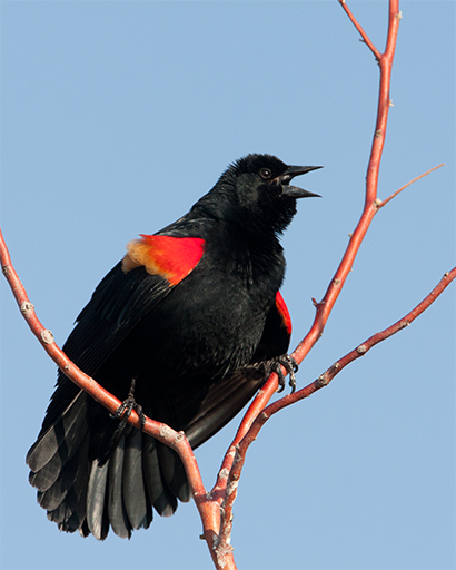
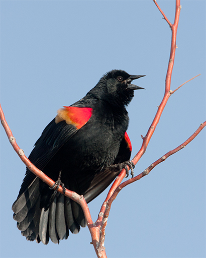
I don’t want to leave you with the impression that Levels adjustments are only useful for images like the jackrabbit that have bell-shaped histograms with few dark shadows and few bright highlights. Consider the photograph of a Red-winged Blackbird in Figure 22.

Figure 22. Unadjusted photo of a male Red-winged Blackbird.
Figure 23 displays the histogram for the unadjusted Red-winged Blackbird photo. Clearly it would be impossible to adjust either the White or the Black Slider without clipping some highlights of shadows. In fact, the narrow peak on the right side of the histogram indicates that some highlights may already have been clipped.
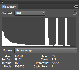
Figure 23. Histogram associated with the Red-winged Blackbird photo in Figure 20.
Clipped highlights isn’t the only problem with the Red-winded Blackbird photo. The main subject is dark and detail is lost in dark areas of the photograph. Some of this detail can be recovered by moving the Gray Slider toward black on the left side of the histogram. This enhances contrast in the darker tones by spreading them out over a larger tone range.
Recall that, contrary to what one might expect, the Gray Slider has a value of 1.0 when it’s set to 50% gray. Moving it to the left increases its value. Moving it to the right decreases its value. Figure 24 shows what happens when the Gray Slider is set to 1.15.
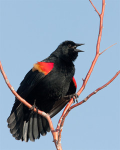
Figure 24. Red-winged Blackbird photo after a Levels adjustment moving the Gray Slider to the left so it has a value of 1.15.
Figure 25 is the histogram for the photo in Figure 24. Notice the combing created by spreading the limited number of dark tones over a wider range and the additional small peaks created by squeezing lighter tones into a narrower range. I used an 8-bit image for this example. If I had used a 16-bit image, changes in the histogram would have been much less apparent.
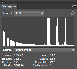
Figure 25. Histogram for adjusted Red-winged Blackbird photo shown in Figure 24.
As we’ve seen, the Levels adjustment offers a powerful tool for enhancing many images, but it falls short for images that have important detail in both shadows and highlights. In my next post I’ll discuss the Shadows/Highlights adjustment. It’s designed to define shadows and and highlights in an image and handle them separately.